Tuesday, December 10, 2013

Blog finally updated!

 This is a digital painting commission I did for  a client of their granddaughter.
It was a gift for her daughter. There is a story behind her outfit! I did slight exaggerating 
to it but it's basically more realistic.
(photo is a bit blurry, actual print is not)
I usually don't frame the art for my clients, but I did in this case.
Clients may want specialty framing and matting done.
Delivery costs can make it more expensive too. 
If clients are local and willing to pay more, I will do it for them.

This caricature styled family portrait  has the same little girl as before.
Here is a big moment for them when they sold their house.

These are some custom clip art illustrations for General Mills. I am trying to evolve my cartooning but
I need to have newer characters interact with ones I did years ago.


I have done some updates to my website. I recently worked for a PC gaming/software distributor doing packaging design. I put a couple example up. Please check it out when you get the chance!

Friday, September 13, 2013

Silver Posebook Sketch

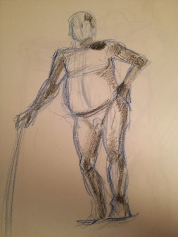
Hanging out with Jon Thunder, doing some sketching from Stephen Silver's Posebook app. 

Thursday, September 12, 2013

ArtSamurai.net Homework For Sept. 4th

Here is my homework for ArtSamurai.net for Sept. 4th.

The theme was storytelling and layout.
The assignment was: Imagine what it'd be like for a superhero (established or your own) to either change into or out of costume. Draw a one-page sequential of this character changing, and create a story around it. Use as many panels as needed. Be creative and have fun!


What I originally turned in for my assignment.

After the workshop I decided I wanted to do revisions to it based on critiques from instructor Tom Nguyen and what I learned from the critiques given to the other students. (Plus some other stuff I just wanted to do!)

I changed Bruce Banner's hair to something more like Mark Ruffalo's. I tweaked the face a bit too. I wanted to have the Hulk's face changed to face straight because that is the "money shot". (I also feel I wasn't pulling off the upward shot.) It's all about practice and trying to get better. It was a good exercise.

Revised Hulk transformation.

The workshops are fun and challenging. I want to improve with each assignment and make the assignments into prints that I could possibly sell. I recommend doing the workshops and doing the same!  :)


Here's my third take on it. After more workshops I feel I am getting better. If I redo it again,  I should just start from scratch! 


Tuesday, September 3, 2013

Tuesday, August 27, 2013

Friday, August 2, 2013

Art Samurai homework for July 31st workshop

The theme for this workshop was "Light and Shadow". The assignment was:
Draw any character you want in an action pose, but try to show "dramatic lighting"
on the subject. Feel free to use photo referencing to help with your light/shadows, and be prepared to show the photo reference along with your homework. Be creative and have fun!


I decided to do the Punisher pointing a gun at the camera. Pretty basic concept but I wanted to concentrate on the focus of "light and shadow". 


I started by taking dozens of photo of myself in the laundry room. I used natural light from the outside window and then the laundry room fluorescent light. The TOP  photo is the original photo. I used Photoshop to lighten it (BOTTOM) to see more details. I duplicated the original photo and made it grayscale (MIDDLE) to see just lights and darks.


  1. I began with a quick sketch of general shapes. I like to use a color while sketching so I feel more loose. If I sketch in black it makes me feel like I need to product the finished drawing sooner. Weird, I know!
  2. I lighten the first sketch and draw over it. I either add a layer to do this or go to IMAGE > ADJUSTMENTS > Hue & Saturation then lighten. This is refining the shapes even more.
  3. I repeat step 2 and lighten and refine.
  4. I add in the dark areas and refine more.
  5. I block in a quick background.
  6. I add a multiplied layer and increase dark areas and shadow.
  7. I stamp all layers into one (highlight the all layers up to this point and hit COMMAND+OPT+E) and hide the blue sketch layers. The new layer of all sketch layers I turn into black & white. IMAGE > ADJUSTMENTS > BLACK & WHITE. I took a photo of some clouds and made that into grayscale and placed it over my background clouds and adjusted it and masked out what I didn't need or like. I then merged it into the layer.
  8. I found a good Punisher logo online and adjusted the opacity to low and put it onto his chest using FREE TRANSFORM and WARP located in EDIT. 
  9. I inked over some areas and tightened some details.
  10. I painted in some more shadows and added some highlights. I gave him a 5 o'clock shadow.
  11. I cropped it and added my signature. DONE!

I feel I am improving with Art Samurai lessons. I am a little biased because I am business partners with Tom Nguyen but I get no special treatment. I am just doing the assignments to improve and for fun! Students get their homework critiqued before me.


If you have questions for me, comment below or email me at:
robb@robbmiller.com

Thanks for checking out my blog!


Wednesday, June 26, 2013

Art Samurai Homework part 2


Here are some assignments from doing Art Samurai. I feel I have a lot to learn 
and I always learn something new from each workshop.
Character Reinterpretation - Gossamer from Looney Tunes
The theme - character reinterpretation. Take a cute character and draw the bad-ass comic book version or take a bad-ass comic book character and draw the cute cartoon version. I like some aspects of what I did. I never totally understood Gossamer as a kid. He was a good monster because he freaked me out. I love how he is smart enough to wear good running shoes to chase after people!

Three guys running
Perspective is the theme here. There's a lot I learned from this assignment. If I were to redo it, I am sure it would be much better. Tom explained perspective better than "How To" books ever have. I fixed my horizon line. You can see my old line on there a little. This was a lesson that went "click". When I do people in perspective in the future I will take what I got from this week.

Demon Baby!
For this one the theme was Layout and Storytelling. Draw a sequential page depicting a monster cornering a helpless victim against the wall. Finish the page dramatically with a hero killing the monster! I tried to have fun with it by not picking traditional characters in the roles needed. The layout could be improved to read it better. I learned quite a bit and had FUN! 

I will continue to do the homework assignments as much as I can.